Our Chosen Font
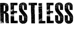
MASTERPLAN FONT
We have chosen to use this font, as it looks edged away and ruined, as if the zombies teeth have torn into someone's artery and their blood is spattering everywhere.
Good:
Bad:
We have chosen to use this font, as it looks edged away and ruined, as if the zombies teeth have torn into someone's artery and their blood is spattering everywhere.
Good:
- Effective (Corroded, edgy, distorted)
- Bold
- Stands out
- Powerful
- Statement
Bad:
- Not colourful enough
- Too shabby/unprofessional
- Might not coordinate with our poster
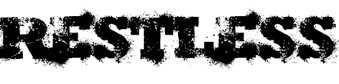
SHOTGUN WEDDING FONT
Good:
Bad:
Good:
- Bold
- Powerful
- Effective
- Scary
- Definitely a representation of horror
Bad:
- Looks more for a zombie film than a paranormal
- Statement rather than subtle
- Too overpowering
- Looks jokey
A.C
